


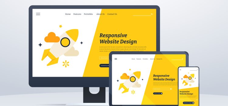
Responsive Design/Mobile Repsonsiveness
In today’s digital landscape, having a mobile-friendly website is crucial for success. With the widespread use of smartphones and tablets, more and more people are accessing the web on mobile devices. As a result, website owners and developers need to ensure that their websites are optimized for mobile viewing.
This article will serve as a comprehensive tutorial on creating mobile-friendly websites using WordPress, one of the most popular content management systems available. We will delve into the concept of responsive web design, which is the approach that allows websites to adapt and respond to different screen sizes and devices.
We’ll explore the importance of implementing responsive design in WordPress and how it enhances the user experience. Responsive design ensures that your website looks and functions seamlessly across various devices, including smartphones, tablets, and desktop computers. It eliminates the need for separate mobile and desktop versions of your site, providing a consistent and user-friendly experience for visitors.
Throughout this tutorial, we’ll guide you through the process of planning and implementing responsive design in WordPress. We’ll cover topics such as choosing a responsive theme or framework, optimizing layouts, handling navigation menus, and addressing mobile-specific challenges.
Responsive Design WordPress
The rise of mobile devices has transformed the way people consume online content. Mobile devices account for a significant portion of web traffic, making it essential for website owners to prioritize mobile user experience. Mobile browsing introduces challenges such as smaller screens, touch-based interactions, and varying network conditions. Responsive design addresses these challenges by optimizing the website’s layout, navigation, and content presentation for mobile devices, ensuring a seamless and enjoyable browsing experience.
Responsive design is an approach that aims to create websites that automatically adapt and respond to the user’s device and screen size. It involves designing and coding websites in a way that allows content to adjust and reflow, ensuring optimal display and usability across different devices. The key principles of responsive design include fluid grids, flexible images, and media queries.
Fluid grids: Instead of using fixed pixel-based measurements, the responsive design utilizes fluid grids that are based on proportional percentages. This allows the website’s layout to expand or shrink fluidly based on the screen size, ensuring a seamless user experience.
Flexible images: Responsive design also involves using flexible images that can scale and adjust proportionally to fit within their container. This prevents images from overflowing or getting cropped on smaller screens, maintaining visual integrity.
Media queries: Media queries are CSS rules that enable the website to apply different styles and layouts based on the characteristics of the user’s device, such as screen size, resolution, and orientation. Media queries allow the website to adapt its design to provide the best possible viewing experience.
What are the Benefits of Responsive Design for User Experience?
- Improved Accessibility: Responsive design ensures that your website is accessible to all users, regardless of the device they use. It eliminates the need for separate mobile and desktop versions of your site, providing a consistent experience across devices. This inclusivity enhances accessibility for individuals with disabilities or impairments who rely on assistive technologies.
- Consistent User Experience: Responsive design ensures that users have a consistent and familiar experience when accessing your website on different devices. It maintains the same branding, layout, and content structure, creating a seamless transition between desktop and mobile views. This consistency builds trust and familiarity, leading to better engagement and user satisfaction.
- Better Mobile Usability: Mobile devices have specific user interaction patterns, such as touchscreens and gestures. Responsive design optimizes the user interface and navigation for mobile devices, making it easier for users to interact with and navigate your website. It improves usability by eliminating the need for zooming, horizontal scrolling, or excessive tapping, providing a smooth and intuitive mobile experience.
- Faster Page Load Times: Responsive design often incorporates performance optimizations, such as optimized image sizes and reduced server requests. This results in faster page load times, which is crucial for mobile users who may have slower internet connections or limited data plans. Improved speed enhances user experience by reducing frustration and increasing engagement.
- Improved SEO Performance: Google and other search engines prioritize mobile-friendly websites in their search results. Responsive design ensures that your website meets mobile-friendly criteria, such as mobile-responsive layouts, readable text, and easy navigation. This boosts your website’s visibility in search engine rankings, driving more organic traffic to your site.
- Adaptability to New Devices: With the constant evolution of devices and screen sizes, responsive design future-proofs your website. It allows your website to adapt and function seamlessly on new and upcoming devices without requiring extensive redesigns. This adaptability ensures that your website remains relevant and accessible to users, regardless of the devices they use.
How to Implement Responsive Design in WordPress
Choosing a Responsive Theme
The first step in implementing responsive design in WordPress is selecting a responsive theme. A responsive theme is designed and coded to automatically adapt and adjust its layout and elements based on the user’s device. WordPress offers a wide range of responsive themes that you can choose from, either from the official WordPress theme repository or from third-party theme providers. Look for themes that explicitly mention their responsiveness in their descriptions or documentation.
Customizing Responsive Themes
Once you have chosen a responsive theme, you can further customize it to align with your brand and design preferences. Most responsive themes provide customization options through the WordPress Customizer or theme settings panel. Here, you can modify colours, fonts, logos, header layouts, and other visual elements to match your brand identity. It’s important to strike a balance between customization and maintaining the responsiveness of the theme. Ensure that your modifications do not interfere with the theme’s responsive behaviour.
Testing Responsiveness
After customizing your theme, it’s crucial to test its responsiveness across different devices and screen sizes. This will help you identify any potential issues or inconsistencies that need to be addressed. There are several tools available for testing responsiveness, including device emulators, browser extensions, and online testing services. Additionally, it’s beneficial to conduct real-world testing by accessing your website on various devices, such as smartphones, tablets, and different desktop screens.
Optimizing Content for Mobile
Responsive design is not just about adjusting the layout; it also involves optimizing your content for mobile devices. Ensure that your text is legible on smaller screens by using appropriate font sizes and line spacing. Break up long paragraphs into smaller chunks for easier reading. Optimize images for mobile by compressing them without compromising quality. Consider hiding or rearranging certain content elements to prioritize the most important information for mobile users. Utilize responsive-friendly plugins or modules for complex content elements, such as sliders or tables, to ensure they adapt well to different screen sizes.
Mobile-Friendly Navigation
Navigation plays a crucial role in the user experience of a mobile website. Ensure that your navigation menus are easily accessible and user-friendly on mobile devices. Use a responsive menu that collapses into a hamburger icon or a dropdown menu for smaller screens. Keep the navigation options concise and prioritize the most important sections or pages. Consider implementing sticky navigation to provide easy access to the menu while scrolling. Test the navigation on various devices to ensure smooth and intuitive interaction.
Performance Optimization
Performance is vital for a responsive website, especially on mobile devices where network conditions can vary. Optimize your website for speed by compressing images, minifying CSS and JavaScript files, and utilizing caching plugins. Use lazy loading to delay the loading of below-the-fold content, reducing the initial load time. Optimize the server response time by using a reliable hosting provider or implementing caching mechanisms. A fast-loading website enhances the user experience and reduces bounce rates.
How to Test the Responsiveness of Your Website
Testing the responsiveness of your website is crucial to ensure it functions well on different mobile devices and screen sizes. Here are some key steps to follow:
- Use Device Emulators: Emulators or simulators allow you to test your website’s responsiveness across various devices without physically owning each one. Popular tools like Chrome DevTools, Firefox Responsive Design Mode, or online emulators provide a range of device options for testing.
- Real-World Testing: While emulators provide a convenient way to test responsiveness, conducting real-world testing on actual devices is essential. Access your website on smartphones, tablets, and different screen sizes to experience it firsthand. This helps identify any issues specific to certain devices or browsers.
- Test Different Orientations: Don’t forget to test your website in both portrait and landscape orientations. Some design elements, like navigation menus or images, may behave differently when the device is rotated. Ensure your website adapts smoothly to these changes.
- Check Cross-Browser Compatibility: Test your website across multiple browsers, including popular ones like Chrome, Firefox, Safari, and Edge. Each browser may interpret and render responsive design differently, so it’s crucial to ensure consistency across all major browsers.
User Experience Optimization
Optimizing the user experience on mobile devices goes beyond responsiveness. Consider the following tips to enhance your mobile-friendly website:
- Streamline Content: Mobile screens have limited space, so focus on delivering concise and relevant content. Prioritize important information and avoid cluttering the screen with excessive text or visual elements. Break up long paragraphs into smaller chunks, use bullet points or subheadings to make content scannable, and ensure a good balance between text and white space.
- Mobile-Friendly Navigation: Ensure that your website’s navigation is intuitive and easy to use on mobile devices. Implement a responsive menu that adapts to smaller screens, such as a collapsible hamburger menu. Optimize the placement and design of navigation elements to enhance accessibility and ease of use.
- Touch-friendly Interactions: Mobile devices rely on touch gestures, so make sure your website’s interactions are touch-friendly. Buttons and links should have adequate spacing to prevent accidental taps and form fields should be optimized for touch input. Implement swipe or swipeable carousels where appropriate, providing a seamless browsing experience.
- Optimized Forms: If your website includes forms, optimize them for mobile users. Use form fields that are large enough for easy input, minimize the number of required fields, and utilize input types specific to mobile devices, such as date pickers or number inputs. Incorporate validation and error messages that are clear and visible on smaller screens.
Mobile Performance Optimization
Mobile users often have slower internet connections or limited data plans, so optimizing your website’s performance is crucial. Consider the following techniques:
- Image Optimization: Compress and resize images to reduce their file sizes without sacrificing quality. Use modern image formats like WebP, and lazy load images to ensure they only load when they enter the viewport.
- Minify CSS and JavaScript: Minify your CSS and JavaScript files to reduce their file sizes, removing unnecessary white spaces, comments, and line breaks. This helps improve the loading speed of your website.
- Caching and Content Delivery Networks (CDNs): Implement caching mechanisms to store static files and assets on the user’s device or at server level, reducing the need for repeated downloads. Utilize a CDN to deliver content from servers located closer to the user, improving loading times.
- Performance Monitoring: Regularly monitor your website’s performance using tools like Google PageSpeed Insights, GTmetrix, or Pingdom. These tools provide insights and recommendations to further optimize your website’s speed and performance.
Plugin Recommendations for Mobile Optimization and Responsive Design
While WordPress itself provides a solid foundation for creating mobile-friendly websites, plugins can further enhance the mobile optimization of your WordPress site. Here are some plugin recommendations to consider:
- WPtouch Mobile Plugin: WPtouch is a popular plugin that adds a mobile-friendly theme to your WordPress site. It automatically detects mobile devices and delivers a streamlined, touch-friendly version of your website. The plugin offers customization options to match your brand and allows you to configure specific mobile features, such as mobile menus, font sizes, and more.
- AMP for WordPress: Accelerated Mobile Pages (AMP) is an open-source initiative by Google that focuses on delivering lightning-fast web pages on mobile devices. The AMP for WordPress plugin automatically creates AMP versions of your website’s pages, optimizing them for faster loading speeds. Implementing AMP can improve your website’s visibility in search engine results and provide a smoother browsing experience for mobile users.
- Smush: Image optimization is crucial for improving mobile performance, and the Smush plugin excels in this area. It automatically compresses and resizes images on your WordPress site without compromising quality. By reducing image file sizes, Smush helps your website load faster on mobile devices, resulting in a better user experience and improved search engine rankings.
- WP Rocket: WP Rocket is a powerful caching plugin that helps improve the loading speed of your WordPress site on mobile and desktop devices. It enables browser caching, page caching, and other performance optimizations, resulting in reduced page load times. The plugin also offers features like minification of CSS and JavaScript files, lazy loading of images, and database optimization, all of which contribute to an optimized mobile experience.
- WP Mobile Menu: WP Mobile Menu is a plugin specifically designed to enhance mobile navigation on your WordPress site. It allows you to create a responsive and customizable mobile menu that is optimized for touch gestures. The plugin offers various styling options, including dropdown menus, icons, and animations, making it easy to create a user-friendly mobile navigation experience.
- Yoast SEO: While Yoast SEO is primarily known for its search engine optimization features, it also contributes to mobile optimization. The plugin helps improve mobile search visibility by providing options to optimize meta titles, meta descriptions, and mobile-specific XML sitemaps. Additionally, it offers readability analysis, ensuring your content is easy to read and understand on mobile devices.
Remember to carefully assess and research each plugin before installing and activating them on your website. Be mindful of plugin compatibility, performance impact, and the reputation of the plugin developer. Additionally, regularly update your plugins to ensure they are compatible with the latest WordPress version and follow best security practices.
Designing mobile-friendly websites is no longer an option but a necessity in today’s digital landscape. With the increasing use of smartphones and tablets, users expect seamless browsing experiences across different devices and screen sizes. WordPress provides a range of tools and techniques to help you create responsive websites that adapt to the needs of mobile users.
Embracing responsive design not only improves user satisfaction but also enhances your site’s visibility in search engine results, leading to increased traffic and better overall success for your online presence.


Comments